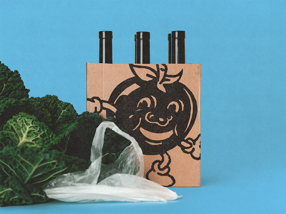
Pröls Bier
Intro
Brauerei Pröls is a Bavarian brewery from Weißenburg. Its move from an industrial area into Weißenburg’s prestigious city centre was the occasion for a full relabel of its core range and a new logo system, aimed at a premium look that works as well on an upscale restaurant table as on a shelf.
Client
Pröls Bier
Services
Date
2026
The Brief
New labels for the core 0.5L range, five beers, a premium aesthetic positioned toward upscale restaurants rather than a purely retail look, plus a logo built to work well beyond the bottle: glasses, T-shirts, delivery vans, merchandise.
Constraints
EU labelling law for beer (ABV, allergens, font sizes), five separate beers that still had to read as one family on shelf, and print production requirements across the whole rollout.
What we at SLAP did
Packaging
The most distinctive move: no body label. Where absolutely every other beer on the shelf wraps a full Set of three labels around their bottles, Pröls Bier carries only a neck label and a back label.
That restraint is not just a powermove that immediately guarantees an look that is unmistakenly, it is also backed by how packaging complexity reads to buyers: a 2023 study found up to 24.6% higher willingness to pay for products in simpler packaging versus visually busier competitors (see footnote).
Stripping the label down signals exactly the kind of restraint Pröls Bier’s restaurant-table positioning calls for, and it reads as different the moment the bottle sits next to a fully-labelled competitor, on a supermarket shelf. The one trade-off that study itself flags, that a simplified design can be harder to identify on a crowded shelf, does not apply here: the neck label alone still carries the color-coding, so the beer stays instantly identifiable even when only the top of the bottle is visible, in a fridge drawer, for instance.
Journal of Marketing (July 2023) Research from Texas Christian University, University of Illinois Urbana-Champaign, and University of Georgia.
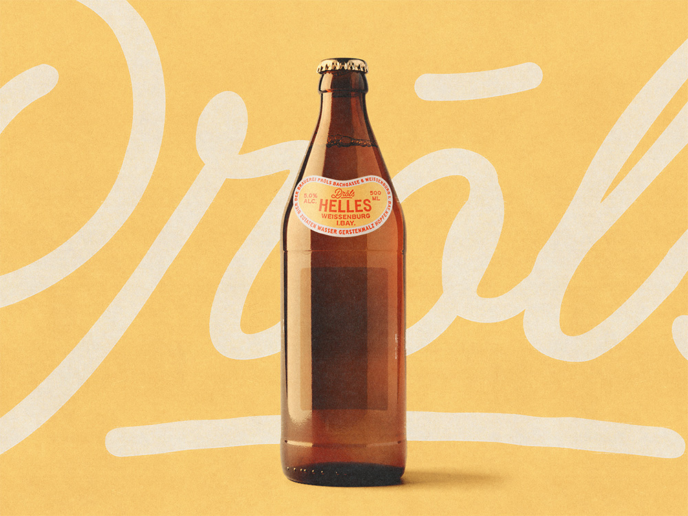
0,5 Liter Euroflasche with the distinctive missing front label.
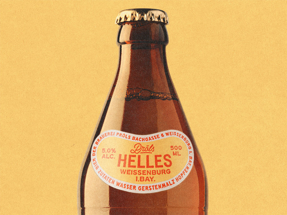
Detail view of the front label.
Design
We based the design on a color-coding system so each beer reads instantly on shelf without relying on typography alone. The direction is strongly traditional. Both the logo lettering and the label typefaces are hand-drawn originals, made specifically for this project rather than licensed.
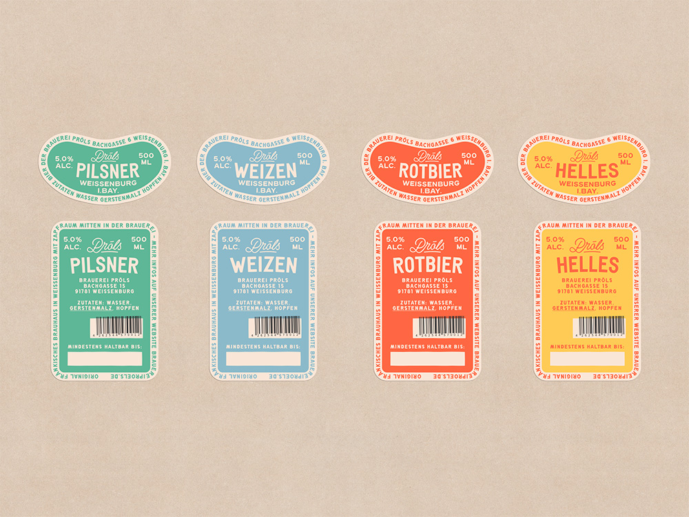
A easy to recognize color system for the brews.
Logo
Set in script, to put the beer’s handcrafted character front and center rather than an industrial one. Built to hold up across glasses, T-shirts, delivery trucks, and merchandise, not just the label.
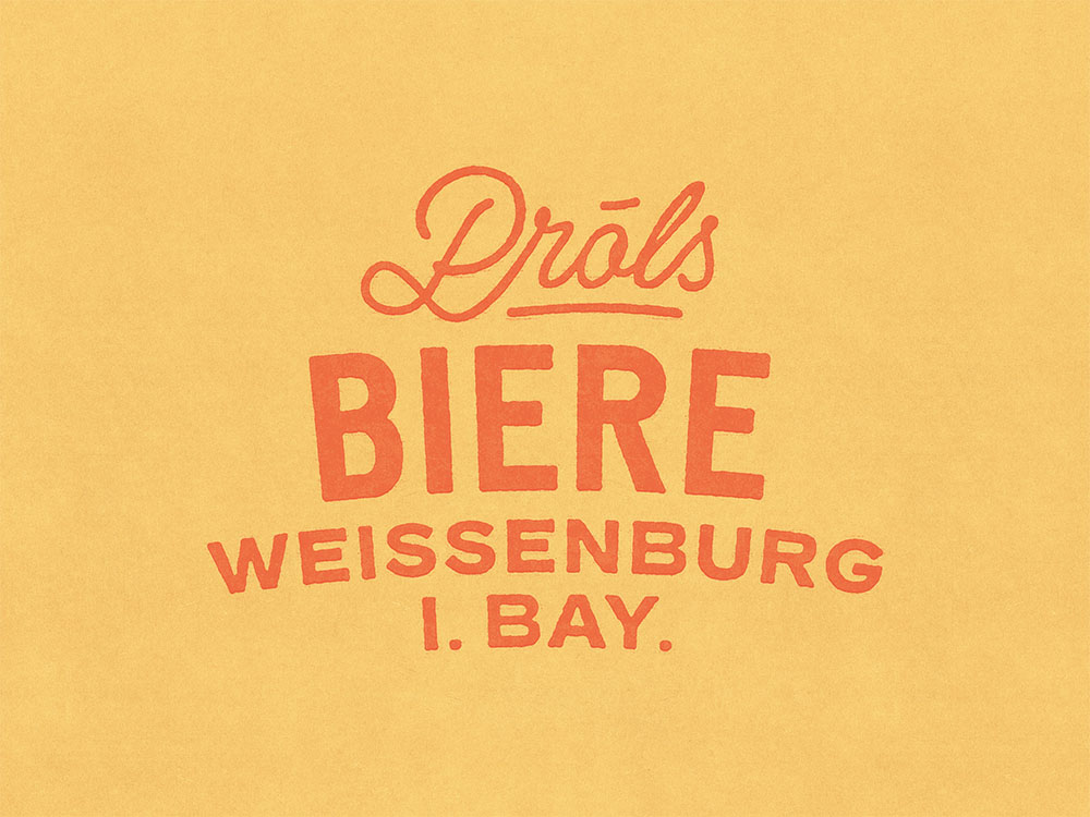
The logo is a traditional wordmark. Nothing fancy here.
Website
Also built by SLAP. Leans on large, bold graphics and carries the same hand-drawn house typography from the labels straight onto the site, rather than swapping it for a generic web font.
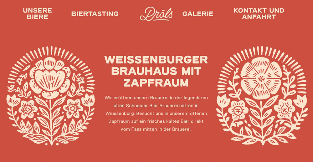
We made a screenshot of the website, but you can also visit brauereiproels.de.