Heatup!
Intro
Heatup! started as a hot sauce its founder, Stephan Schibalsky, cooked for friends. Demand kept growing until he decided to bring it to market. He came to SLAP for the full build: product and shelf-stability work, packaging, labels, brand identity, and the website.
Client
Heatup!
Services
Date
2026
The Brief
Stephan had run businesses before and brought real food-industry knowledge into the project. What he didn’t have yet was a bottle, a label, or a brand built to compete on a hot sauce shelf where most products reach for the same look.
Constraints
Food-safety and shelf-stability rules for a hot sauce, including hot-fill-compatible packaging and correct allergen declaration for celery, plus a retail shelf where most competitors lean on the same handful of clichés: skulls, chili peppers, flames.
What we at SLAP did
Packaging
Stephan and SLAP started with different ideas about the bottle. We landed on glass, driven by a short list of hard requirements: it had to handle hot-fill temperatures, and the sauce had be visible in the container.
A 2026 consumer-psychology study found transparent food packaging drives a 4x higher choice rate and 40.6% higher purchase interest (see footnote). Reason enough to drop the non-transparent plastic squeeze bottle also on the table early on. The red sauce visible through a yellow label is a deliberate color pairing: it shows stronger through glass than it would on opaque plastic.
Marckhgott, E., Kamleitner, B., & Estes, Z. (2026) – A window of opportunity: transparent packaging affects product preference via psychological ownership. International Journal of Research in Marketing.
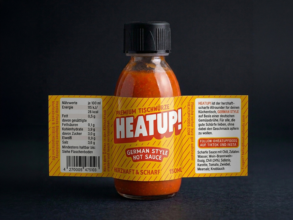
Label wrap-around on the original glassbottle. This is an AI rendering. The original product shoot is coming soon.
Label & positioning
We went commercial rather than artistic here, more than on most SLAP projects: a label built to stand out on the hot sauce shelf at first glance, and to skip every category cliché (skull, chili pepper, flames) on purpose. Positioning: German Style Hot Sauce, its own category next to Louisiana or Caribbean style, built on a vegetable-broth base (celery, carrot) instead of the usual vinegar-forward one. Celery does double duty: it thickens the sauce so it spreads better than most competitors, and it adds umami. Both are called out directly in the marketing.
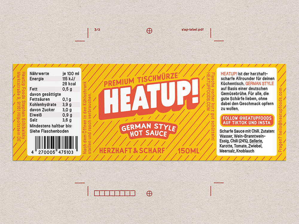
Flat-lay of the HEATUP! label. A lot of information had to be packed on 150×55 mm.
Website & e-commerce
Built to lead with the same differentiation, category and benefits both, not just claim them. Platform: WooCommerce. Shopify would have been overkill for a single-product brand at this stage. Priorities: open source, easy setup, easy content editing.
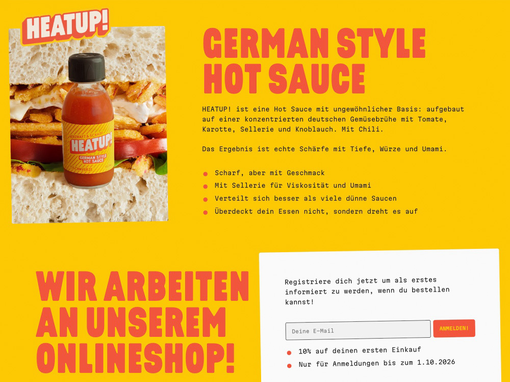
We made a screenshot, but you can also visit heatupfoods.com.
Logo
Designed to survive a wide range of physical applications without breaking: stickers, die-cut stickers, patches, and embroidery on a textile apron.
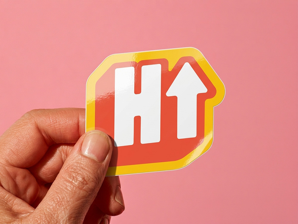
The logo also exists in an abbreviated version.
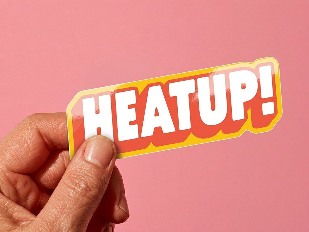
The HEATUP! logo as a glossy die-cut sticker.
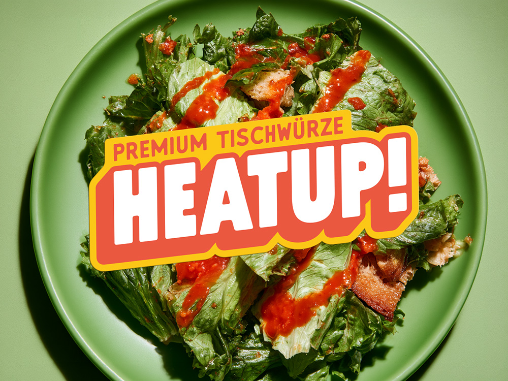
The HEATUP! logo in a healthy everyday use.