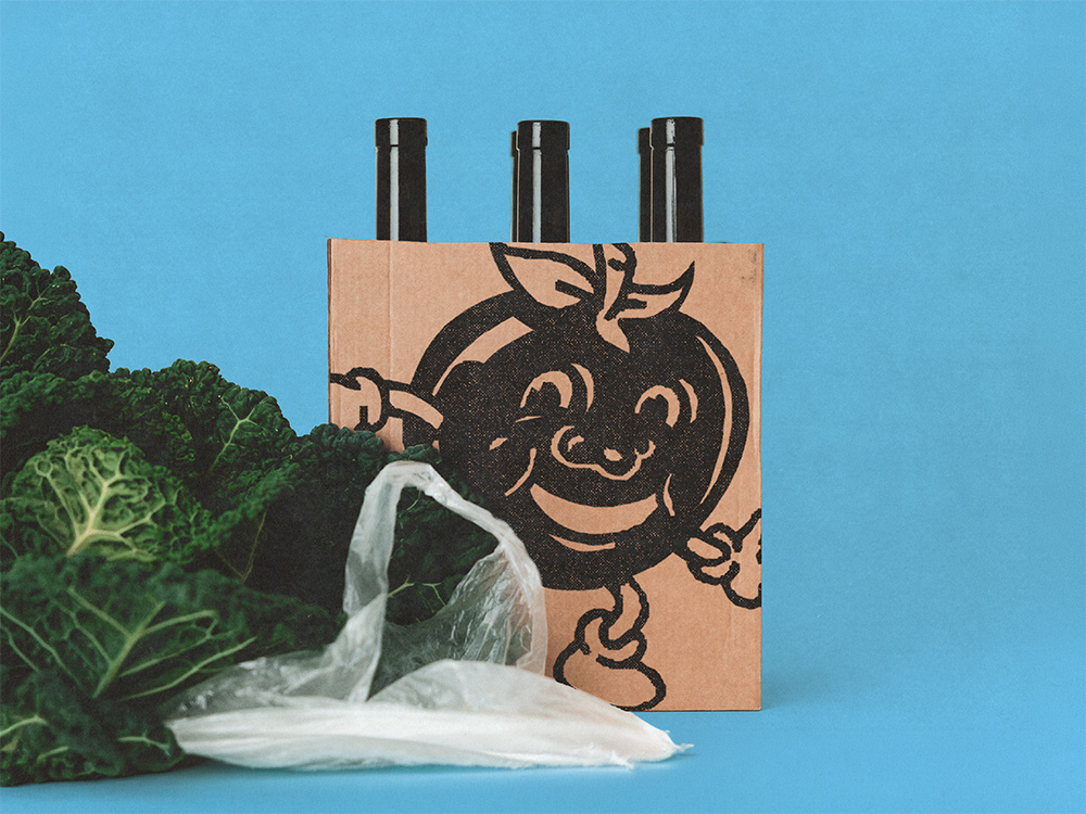
Schneider Kirchweihbier
Intro
Brauerei Schneider commissioned SLAP to design the label for its Kirchweihbier, a Pilsner brewed for the Weißenburger Kirchweih, one of the largest Kirchweih festivals in Bavaria.
Client
Schneider Bier
Services
Date
2024
The Brief
A standout label for a one-off festival beer: a 0.33L Pilsner bottle that had to read as an occasion, not just another Pils on the shelf.
Constraints
A single-run festival product, sold and recognized in a short window around the Kirchweih. Standard EU beer labelling rules (ABV, allergens, font sizes) still applied despite the limited run.
What we at SLAP did
Label Design
Designed the label in a die-cut shape rather than a standard rectangle, a deliberate departure from the plain label most Pilsner bottles carry, built specifically to stand out as a festival occasion piece rather than an everyday shelf product.
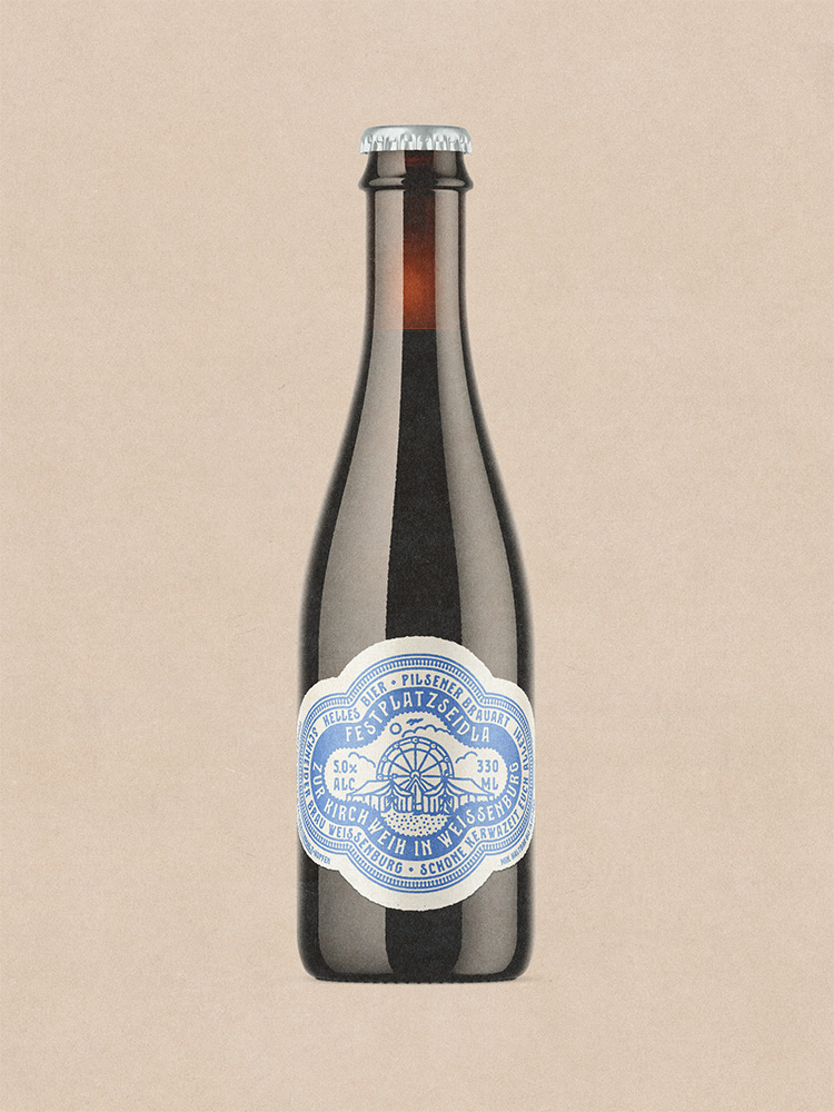
The original die-cut label design we printed for the small bottle.
Misc.
We had some good press pickup, and when the beer didn’t return the following year, local coverage and social media both called it out. That’s the harder thing to manufacture: people noticing a limited-run product is gone.
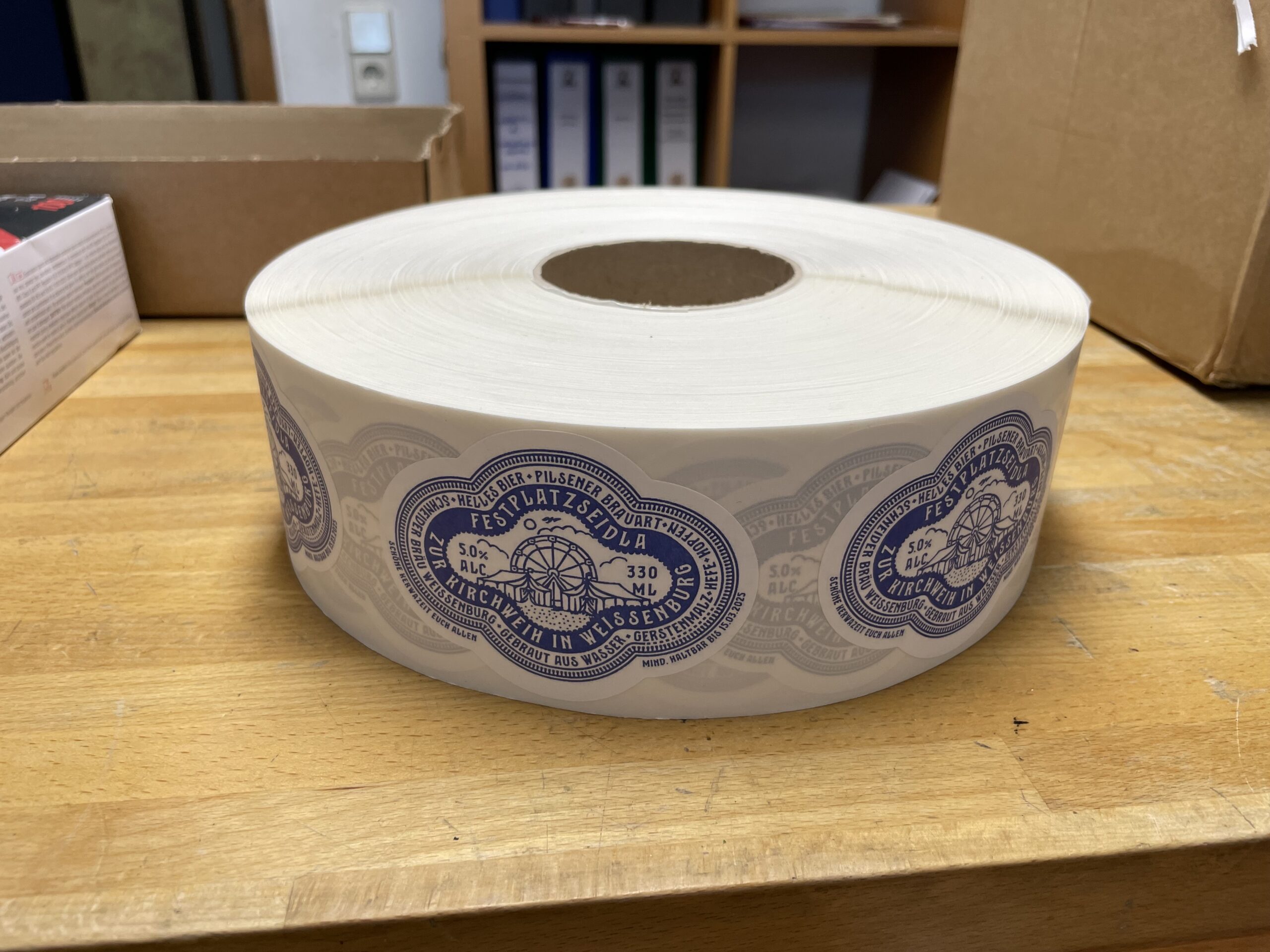
One million beer, please.
Down at the bottling facility.
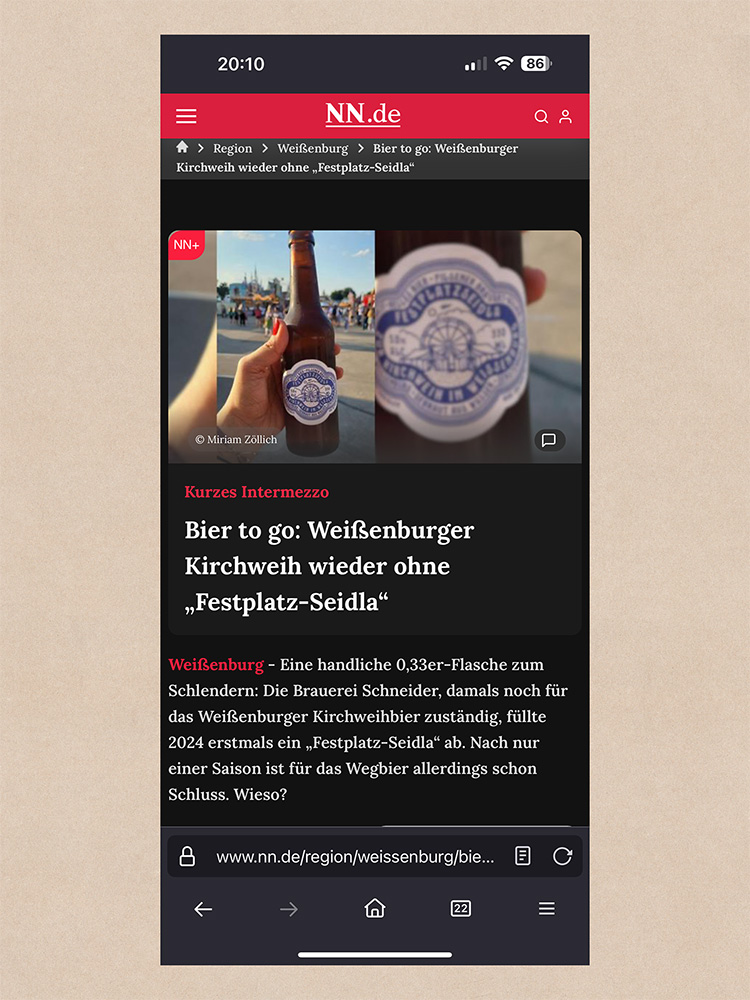
The press wondering why it’s not available anymore. Here in Germany we have a saying: You only notice what you had when it’s already gone.